Thursday, 23 April 2015

CULTURE JAM


1.  What aspect of your cultural jam do you find most successful and why?
I find it all successful because it's funny and looks somewhat real.
2.  What aspect of your culture jam do you find least successful and why?
Nothing, because it's perfect.
3.  If you could do this project again, what changes would you make to improve it?
Probably the colouring in the man and angel wings because they don't blend in as well as they should, BUT I can get away with it because the lighting coming in from the hole in the roof kind of makes it look like he's supposed to be that bright and standing out that much.  

ORIGINAL AD

Tuesday, 14 April 2015

CULTURE JAM QUESTIONS


1.  What company does the advertisement represent/subvert?
- Cover Girl.
2.  What kind of product(s) is being advertised?  
- Beauty products.
3.  What imagery is used in the advertisement to subvert?
- A paper bag.
4.  What message (text, copy) is used in the advertisement? 
- That beauty standards are always raised and you'll probably never keep up.
5.  How are the elements and principles of design used to convey a message?
- Good colours and use of photo sizes.
6.  Who is the target audience of the advertisement?
- Woman.
7.  Does the ad jam convey a clear and successful message?
- Somewhat, i'm understanding that it's pretty much saying that no matter what you do you can't look like those people in ads, so just put a bag over your head. The other thing i'm understanding from this is that putting that much makeup and things on your face is pretty much like covering your face.

8.  How could the ad jam be improved?
- More clear on what message it's trying to convey.


1.  What company does the advertisement represent/subvert?
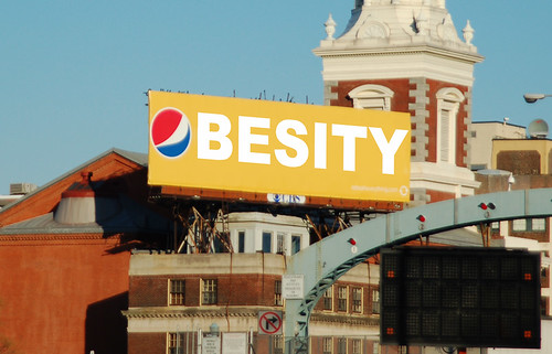
- Pepsi.
2.  What kind of product(s) is being advertised?  
- Pop.
3.  What imagery is used in the advertisement to subvert?
- One big word, Obesity.
4.  What message (text, copy) is used in the advertisement? 
- That pop makes you fat.
5.  How are the elements and principles of design used to convey a message?
- The bright colours to make it pop (pun intended). The simplicity makes it very clear what the message is.
6.  Who is the target audience of the advertisement?
- People who drink pop.
7.  Does the ad jam convey a clear and successful message?
- Yes, it spells obesity and uses the Pepsi logo as the 'O'.

8.  How could the ad jam be improved?
- I like it how it is, 


Wednesday, 8 April 2015

APOCALYPSE


Katelyn Steckley
No Hope
Photoshop
April 7th, 2015
   
     In my work I made my own brushes, which I have never done before. My idea was to showcase last chances, because through life you think you're always guaranteed a second chance. This artwork shows that these people had several chances to save the world but didn't. I have a plant growing but a guy is setting an oil can over it because he is oblivious and wasted the last chance of getting natural resources. My ideas did change but only the slightest bit. I wasn't really influenced by any artists, I just tried to create my own kind of style. For the apocalypse idea though, I looked at T&T's work even though I didn't base my whole piece on it.

     I made the background stuff really far back and the stuff in the front really far forward making your eyes move up and down. To do that i used deep dark blues in the background and bright reds in the front area and greens and oranges ass middle tone types. To make your eyes move from left to right, I used different sized brushes and I also overlapped brushes to keep your eyes moving to see what object is next and so on. I used different objects to build the little shelter and also the flowers in the tire, which brought the whole 'apocalypse' subject matter to life.

     I didn't really have motivation to get this done, I mostly just wanted to have it done with. Variety was used well in my project because I had a whole lot of different objects and such making it have a lot of different things to look at. It turned out better than I thought it would so that surprised me. With additional time I think my work would end up looking crowded and overwhelming because I like to add and add things so it's nice to have a specific time to stop as a reminder to slow down.