Friday, 15 May 2015

ANIMATION

Seth MacFarlane was born in Kent, Connecticut on October 26th, 1973. He went to the Rhode Island School of Design and studied animation. After he graduated he was hired by the Cartoon Network as an animator and writer for Johnny Bravo and Cow & Chicken. He then worked for Walt Disney Animation for a bit, then FOX called him and offered $50,000 to create a pilot for a show, which became Family Guy. In 2001 he was supposed to board Flight 11 which was the first plane to hit one of the twin towers, but he didn’t get on it due to his flight agent’s mix up. Seth was inspired by the tv show All In the Family to write for tv.

His trademarks he often uses in his work are broadway musical numbers that randomly happen in his shows. His characters he animates usually have large heads. Seth also uses a lot of pop-culture references in his work. He always hires Walter Murphy to write all the music in his shows and things. He also tends to voice a good chunk of different characters in each of his shows.

MacFarlane named his production company after a door from where he lived when he went to school that was fuzzy, Fuzzy Door Productions. He also based some characters off of people he went to school with and who worked at his school, like the security guard he based Peter Griffin’s voice off of. A 90 year old couple who trained Frank Sinatra, also voice trained Seth. He is good friends with the creator of the Fairly OddParents and Danny Phantom.

Thursday, 23 April 2015

CULTURE JAM


1.  What aspect of your cultural jam do you find most successful and why?
I find it all successful because it's funny and looks somewhat real.
2.  What aspect of your culture jam do you find least successful and why?
Nothing, because it's perfect.
3.  If you could do this project again, what changes would you make to improve it?
Probably the colouring in the man and angel wings because they don't blend in as well as they should, BUT I can get away with it because the lighting coming in from the hole in the roof kind of makes it look like he's supposed to be that bright and standing out that much.  

ORIGINAL AD

Tuesday, 14 April 2015

CULTURE JAM QUESTIONS


1.  What company does the advertisement represent/subvert?
- Cover Girl.
2.  What kind of product(s) is being advertised?  
- Beauty products.
3.  What imagery is used in the advertisement to subvert?
- A paper bag.
4.  What message (text, copy) is used in the advertisement? 
- That beauty standards are always raised and you'll probably never keep up.
5.  How are the elements and principles of design used to convey a message?
- Good colours and use of photo sizes.
6.  Who is the target audience of the advertisement?
- Woman.
7.  Does the ad jam convey a clear and successful message?
- Somewhat, i'm understanding that it's pretty much saying that no matter what you do you can't look like those people in ads, so just put a bag over your head. The other thing i'm understanding from this is that putting that much makeup and things on your face is pretty much like covering your face.

8.  How could the ad jam be improved?
- More clear on what message it's trying to convey.


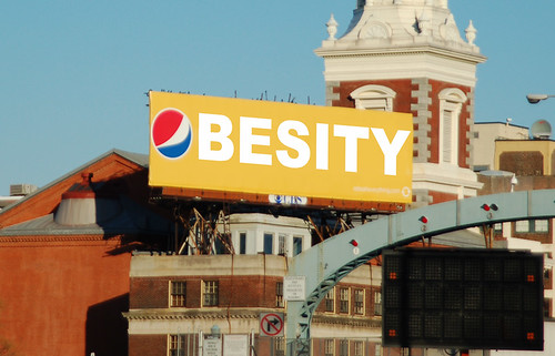
1.  What company does the advertisement represent/subvert?
- Pepsi.
2.  What kind of product(s) is being advertised?  
- Pop.
3.  What imagery is used in the advertisement to subvert?
- One big word, Obesity.
4.  What message (text, copy) is used in the advertisement? 
- That pop makes you fat.
5.  How are the elements and principles of design used to convey a message?
- The bright colours to make it pop (pun intended). The simplicity makes it very clear what the message is.
6.  Who is the target audience of the advertisement?
- People who drink pop.
7.  Does the ad jam convey a clear and successful message?
- Yes, it spells obesity and uses the Pepsi logo as the 'O'.

8.  How could the ad jam be improved?
- I like it how it is, 


Wednesday, 8 April 2015

APOCALYPSE


Katelyn Steckley
No Hope
Photoshop
April 7th, 2015
   
     In my work I made my own brushes, which I have never done before. My idea was to showcase last chances, because through life you think you're always guaranteed a second chance. This artwork shows that these people had several chances to save the world but didn't. I have a plant growing but a guy is setting an oil can over it because he is oblivious and wasted the last chance of getting natural resources. My ideas did change but only the slightest bit. I wasn't really influenced by any artists, I just tried to create my own kind of style. For the apocalypse idea though, I looked at T&T's work even though I didn't base my whole piece on it.

     I made the background stuff really far back and the stuff in the front really far forward making your eyes move up and down. To do that i used deep dark blues in the background and bright reds in the front area and greens and oranges ass middle tone types. To make your eyes move from left to right, I used different sized brushes and I also overlapped brushes to keep your eyes moving to see what object is next and so on. I used different objects to build the little shelter and also the flowers in the tire, which brought the whole 'apocalypse' subject matter to life.

     I didn't really have motivation to get this done, I mostly just wanted to have it done with. Variety was used well in my project because I had a whole lot of different objects and such making it have a lot of different things to look at. It turned out better than I thought it would so that surprised me. With additional time I think my work would end up looking crowded and overwhelming because I like to add and add things so it's nice to have a specific time to stop as a reminder to slow down.


Wednesday, 25 March 2015

HERO MOVIE REFLECTION


HERO MOVIE REFLECTION

1. This movie is an art movie because it was serious, there were no jokes or parts that were intended to be funny. It is also an art movie because didn't have a large budget or big named actors in it, therefore it was not meant for a mass audience. This movie was also confusing which is what also made it an art movie, it was hard for me to tell the flashbacks from the present scenes so I got confused.
2. The director makes this movie for everybody because it is based on true events and history and shows how they changed history which some people find interesting. Another thing that makes it appealing to the average viewer is the fight scenes, for all the action lovers and movies feel more slow without fight scenes or any kind of action type. This movie was also appealing for average audiences because there was a love story to it and who doesn't love a good love story.
3. I didn't mind this movie, like I didn't hate it but I also probably wouldn't watch it again. I really liked the artistic parts of this film, like the use of slow motion. In the sword fight parts I liked all of the slow motion parts and how they made it the movie more eye catching and interesting. I also really liked the different perspectives and angles of how the movie was shot. In the scene with the sword fight in the water I thought it was cool how they shot it like you were above the water at some points and under it the next. The use of colour like in the golden forest was also something I loved about this movie.
4. He used colour to emphasize and enhance The Golden Forest scene when the girl got stabbed and the whole forest turned from gold to red to show kind of a sorrow feeling and like the forest was being drained and bleeding out as well. The red clothing along with the gold background made the two woman pop out more and even though it was in a forest you could clearly see the two woman even when they had leaves swarming around them.

Friday, 13 March 2015

APOCALYPSE BRAINSTORM

APOCALYPSE BRAINSTORM


1. What do you think could be a possible end of the world? How do you think this particular disaster would affect the physical environment? (Ie. Would there be a lot of explosions, charred buildings, etc.)


I think a lack of natural things that are needed to live life could cause a possible end of the world. I think this would affect the physical environment because there wouldn’t be any land good enough to grow food, it will all be burned ground and asphalt everywhere.


2. What particular aspect do you think you would like to show in your piece of art? Ex. The psychology of the survivors, the physical world and how it’s been rebuilt? Perhaps a more positive world, where we are ecologically and socially harmonious with the future landscape?


In my art I would like to show the rebuilding of society, because there won’t be any natural supplies or beauty left. So it will have to work around that by using what is left, like computers, buildings and cars. My art isn’t a happy ending because once you run out of natural resources you are stuck with all that’s left.


3. What are ten things that you think would survive the disaster that you would like to portray? Why do you think these things in particular would make it?


- Most people.
- Pollution.
- Buildings.
- Computers & technology.
- Weapons.
- Tires.
- Rubbish.
-Things that aren't eco-friendly
I think these particular things will make it because they are what brought this on and ruined the world in the first place so that is all that is left. To show that people took advantage of natural resources and now they have to try to live without them, which is impossible.

4. What could serve as a symbol of hope in your picture?
A symbol of hope in my picture will be a very small little plant that is starting to sprout, but I plan on putting something near it that is about to ruin the second chance but not quite.


5. Take a look at the art or T&T (Tyler Brett and Tony Romano), specifically, Onward Future. These artists depict a future that can be recognized because their vision is based on trends we see around us now. They offer a chance to imagine and understand what the future may possibly hold. What do you think about their art? What do you think makes their work appealing to others?

I thought it was interesting and different. It’s not the type of art that really appeals to me, but others might like the cleanness of it and how it’s made with illustrator.

Tuesday, 10 March 2015

3D IMAGES

magenta, cyan and yellow on white

red, green and blue on black

red, white and blue on black

Sunday, 22 February 2015

MANTAGE


Katelyn Steckley
Monsters In Your Closet
February 22, 2015

      My idea is to showcase the fears people have, I chose to use the noise effect on the pictures that had to do with the fears themselves to make it stand out. The man who is covered in noise shows the people who let their fears control them and not let them do what they want with their life. The wolf with the arm coming out of it; the arm is only partly covered in noise because this is showing the process of being consumed by your fears. I also thought it would be a neat idea to make the object that draws the most attention, the smallest object, which is the little boy laying by the door of his closet. My idea sort of changed because in the beginning I just thought it would look cool to have some things in with the noise effect, and as I went along I came up with some symbolism behind it.

      I made all the pictures gloomy and made them darker so that they would all fit together better, I also turned down the opacity of a bunch of images to draw less attention to them. I did all of these things to draw less attention to the other photos and draw more attention to the door by leaving it the most vibrant and colourful image in the photo, even though it's the smallest. Your eye will wither start at the door or the eye, and they'll just scan along the top of the photo because that's where i chose to place all of my images so it would be just the right amount of cluttered.

      I wanted to have something different, (the noise effects throughout) to make it stand out and somewhat memorable and that's what kept my ideas motivated.

      The elements I find the most successful are the door and the wolf with the arm coming out of it. I think the door is because of the reason I stated before how it's the smallest image but the one that catches your eye first. I found the wolf with the arm coming out of it successful because I really liked my idea I had to make it partly covered in noise to show how fear consumes you. With additional time I would have added more photos and more brushes and would have made it all fit together more and made it more clean looking.


Wednesday, 11 February 2015

MONTAGE BRAINSTORM


THE INVISIBLE
- Thoughts throughout the day
- Abuse
- The monster in your closet
- Who you really are
- Love
- Ghosts
- Secrets
- Dreams at night
- Admiration
- Unfinished homework

THE MONSTER IN YOUR CLOSET
   
     This idea is appealing to me because the subject matter is things that you are scared of and hide away, like a monster in your closet. This idea is interesting because not very many people think of the things they are scared of because they are trying to avoid them, therefore making them invisible. I also like this idea because I gave it a cool title that sounds simple and straight forward but it has a deeper meaning to it.

     In a piece of art I would like to say that it is okay to let your fears be known and that everybody has fears they are hiding. I would like it to say that, but in a very hidden way full of symbols that you will probably mentally understand but not know it. If I can achieve that in any way in this future piece of art, that is what I am aiming for.

     When viewers see my potential artwork, I hope they will feel a sense of comfort and are able to relate to it somehow. I hope the relatable aspect of my artwork is what gives the viewer that sense of comfort. I do not really want to tell people how to feel with this particular piece, I would like the viewer to pick up their own feeling from it, and have everybody feel a different unique feeling from one another.